RHP Partnership Architects are the architects behind the multi-million pound refurbishment of our Grade II* listed building. We caught up with project architect Dave Sweeney to find out more about how RHP transformed the building and how to breath new life into an iconic structure.
What was your design philosophy when working on the plans for Attenborough Centre for the Creative Arts? What were the steps in the design process of the building and what inspired to make the choices you made to form this building?
At the time of our commission, the Gardner Arts Centre, as it was known previously, had lain unused and closed for several years. Our task was to work with the University of Sussex to re-establish it as a self-sustaining centre of excellence for academic research, conference use and public performance.
The modern day requirements of this multi-faceted brief had then to be reconciled with an existing, Grade II* listed, iconic 20th century building. Here, we needed to create a functional, useable space – a space that would be flexible, experimental and innovative, whilst also being practical and functional – all within a limited budget.
We tend to take a more holistic approach to design in our practice; each project we work on creates a bespoke and unique building, and so it’s very important to talk with those people who will ultimately be using the space. From this research, we can then ascertain how our design can best support these uses.
So, we carried out careful and informed design research, which included a number of thorough assessments of the existing building (designed by Sir Basil Spence in the 1960s), and consultations with both English Heritage and the conservation team at Brighton & Hove City Council. It was essential for any design to by sympathetic to the existing building’s fabric, character and use.
Wherever we could, we kept to the existing shape and configuration of the building, using spaces within its structure to run the newly servicing equipment and identified the only location in the whole building where a glass lift, providing disability access to all levels, could be installed. Perhaps the most dramatic intervention was in the main auditorium where, in a bid to both respect the original drum form yet provide a suitable acoustic environment, a new system of angular, timber baffles was installed, visually lifting the whole theatrical experience.
How would you describe our building in a way that would set it apart from other creative arts centres?
The revitalised centre is the beating heart of the practice-based arts, both on the University campus in providing for research and conferencing, and reaching to the wider, non-academic community catering for top tier contemporary public performance.
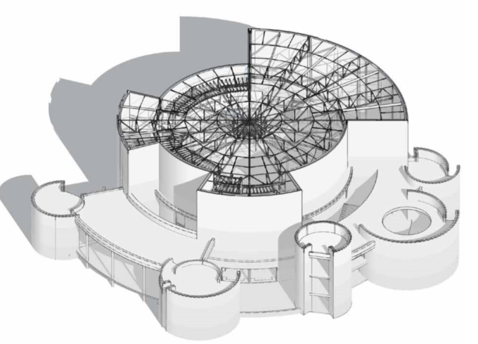
The main auditorium is capable of hosting flat floor events, promenade performances, interactive installations and experimental music. Acoustically and technically, the building is now able to accommodate professional productions. Outside the main drum of the auditorium, the three separate towers provide for teaching and learning rooms whilst the original Spence-designed public spaces now offer a café-bar and an exhibition space.
Unique to Attenborough Centre for Creative Arts is this fusion of contemporary academic learning and research and public performance, all set within an iconic building of great architectural importance.
What was the reasoning(s) behind all the circular structures?
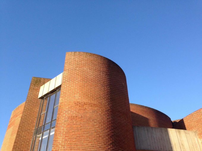
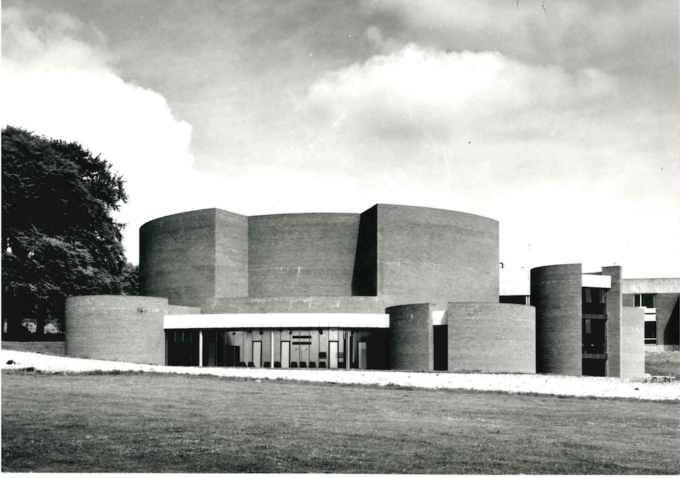
The original reason for the circular structures was entirely aesthetic – Sir Basil Spence’s vision for the campus was a collection of buildings which connected to land and each other.
The initial idea for the circular structures came from an earlier design for the University’s Meeting House, which consisted of varied masonry cylinders. Due to budgetary reasons, this idea was never built – a simpler version of it being realised instead - and so that design was adapted for this building.
Spence wanted the building to act as a ‘corner piece’, where the campus would meet the landscape of the South Downs – appearing to be anchored directly in the natural landscape. This drew upon similar inspirations to the rest of the campus, notably the aspiration to always see through the buildings to the existing mature and tree lined landscape beyond. Hence, the vaulted gaps within Falmer House. Other visual influences could have been drawn from the late period Le Corbusier (the Maisons Jaoul, the Millowners’ Building in Ahmedabad with its unfurling curved auditorium) and Louis Kahn’s early 1960’s work with brick, concrete and pure geometries (notably the Indian Institute of Management, also in Ahmedabad).
Our task was to work with this set of forms, and discover ways in which to make them suitable for performance, thereby breathing life into a facility now suited to the needs of the 21st century.
What are the main differences between the original design by Sir Basil Spence to the now renovated building?
Sir Basil Spence’s vision was of a functional, unique, arts teaching theatre set within the context of mid 20thCentury progressive performance. However, as time past, the building was repeatedly failing to meet the requirements of a contemporary theatre. Sadly, this was largely due to its unique design causing practical constraints for many travelling theatre companies.
Our new design addresses these shortcomings– and allows for a flexible auditorium that is supplied with modern services; a new properly sized control room; revised access arrangements to permit adequate stage and equipment movements; and that is supported by high end theatre tech, all facilitating innovative teaching and learning practices.
We were also designing with greater energy efficiency in mind – something that may not have been at the forefront of an architect’s mind in the 1960’s. New windows were commissioned and additional roof insulation was installed to boost thermal performance.
Accessibility was also fundamentally improved throughout the building with the installation of a new passenger lift and a back-of-house disabled platform lift.
Whilst the peripheral spaces to the main auditorium were re-purposed, the external building was carefully repaired, and any modern additions were always considered with the original Spence design in mind – after all, it’s unusual circular shape is what makes the centre so different and unique
Have you been back to ACCA since the building’s completion and what have you enjoyed seeing here?
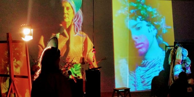
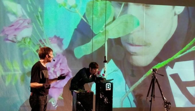
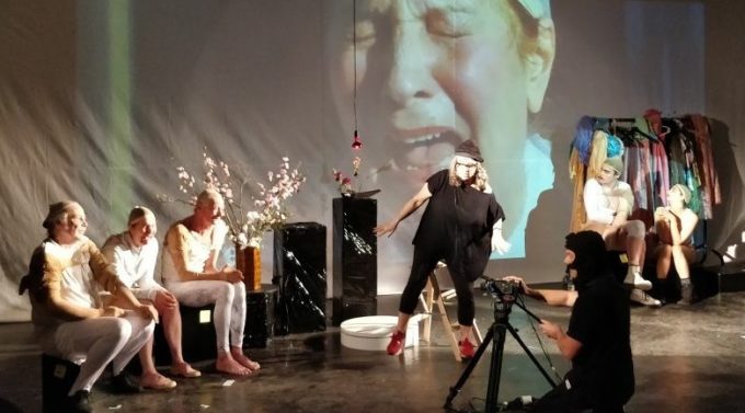
We attended the opening public event of ACCA in the Brighton Festival in 2016 – a one man performance of Complicite’s The Encounter by Simon McBurney – 2 years before it hit The Barbican in London. The performance was utterly breath-taking, with the audience using headphones to witness McBurney’s powerful use of the spoken, recorded and projected voice, adding to the sense of being cocooned deep within the Amazon jungle of which he spoke, and deep within the timber lined womb of ACCA.
We’ve held a number of guided tours since the ACCA project completed too, all who we’ve taken round have uttered an audible gasp on entering the new auditorium and most are fascinated to hear of the building’s transformation.
We also held RHP’s 40th anniversary celebrations at ACCA and were honoured to have Michael Attenborough present who delivered an excellent summary of the project.
The team at ACCA are devoted and very hardworking, and it’s thanks to them that the building is now a success. It’s extremely rewarding to see one of Brighton’s best loved theatres once again being used and enjoyed as it was originally intended and it is very gratifying to think that we’ve had a hand in bringing it back to life.

